A Quick Theory of Colour
Updated: 5 days ago
We know when colours feel right, and we might even understand some of the mechanics behind it, but a colour wheel can be a helpful tool for crafters when looking for colour combinations for card design.
The Quick Creative Colour Wheel: Free Download below
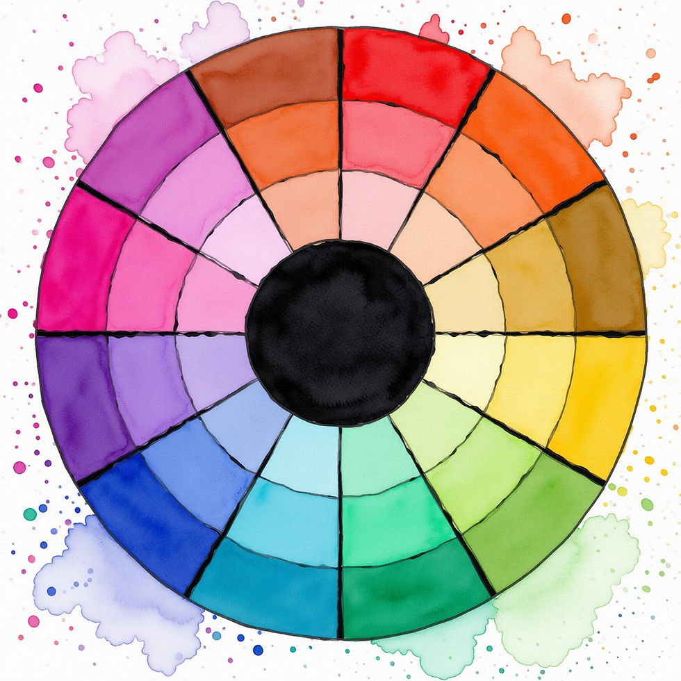
Colour Combinations for Card Design
Artists and scientists have been peering at light and colour for centuries, trying to make sense of how it actually works. Some reach for physics, some look at how the eye works, but most of us just trust our instinct. Colour lives everywhere. It's in the wavelengths, and in the way it makes us feel. Red, yellow and blue are usually regarded the primary colours, because they're the traditional starting point for mixing paint. From these we get the secondaries (orange, green, violet) then the tertiaries, and suddenly we have the twelve hues that sit around the colour wheel most of us learned at school.
The name of a colour is its hue, e.g. magenta; its value tells us how light or dark it is (black and white are values rather than hues); its saturation is how pure or muted it is; and finally its temperature, which is whether it reads as warm or cool. You've probably adjusted all of these instinctively when using image editing software on your phone. It's intriguing to notice the way different hues relate to each other, based on their position on the wheel - complementary colours sit opposite each other and create tension, while colours next to each other are analogous and blend more quietly. Cardmaking Colour Guide
While colour theory gives us the structure, colour itself is something we tend to experience. Josef Albers spent a career proving exactly that; his most famous work, Interaction of Color (1963), set out to show that colour doesn't exist on its own. As a teacher at the Bauhaus in the 1920s, he would bring a suitcase of coloured papers collected from printers and old catalogues, and get his students to tear and arrange the pieces alongside each other, bringing their attention to how colour shifted depending on what was around it. Once you start looking for it you'll notice that a grey square with no inherent colour bias reads warm alongside blue, yet cool alongside orange.
A little example of the interaction of colours worked out in paper and glue.
Crafty Colour Combinations
Claude Monet once said "Colour is my day-long obsession, joy and torment." Most things we love are like that aren't they? Seeing what other people do with colour can instantly lift us into a fresh space, and spark new ideas. Check out more inspiration on Pinterest.


Connect with colour
Discover 100+ Ideas in the Card Couture FlipBook


